Watch Along: Designing Creator-Led Viewing to Convert Casual Sports Fans
FanCode's Match Detail Page was where new users decided to watch — or dropped off. I led the UX for Watch Along, a new feature that lets fans watch live matches alongside their favourite creators. The bet: casual fans who come for entertainment, not the sport, need a different reason to stay — and a creator they already follow is that reason.

Lead UX designer
Mobile Web
Discovery of relevant content
Challenge
FanCode's conversion funnel had a persistent leak: new users landing on the Match Detail Page (MDP) during a live match and leaving without converting. Our existing MDP was built for the sports fan who came for the game. But a large segment of drop-offs were casual fans — people who come for entertainment, not match skills.
Watch Along was the answer: live creator streams layered on top of the match, so a fan of the creator gets pulled into the match through a voice they already trust. We expected 80% of Watch Along's new users to be creator followers arriving from YouTube, Twitter, Facebook, and Instagram.
The brief broke into three UX problems:
Make Watch Along work seamlessly inside existing flows — every MDP state, user type, and live-timing scenario
Design the landscape experience — add the creator layer without hampering the core viewing experience
Solve discovery and branding — how users find Watch Along across the app
4 - 5.5%
Increase in conversion
65%
Landing from home to MDP
84%
Increase in time spent on website
Fitting Watch Along into Existing Flows
One page, many states.
The MDP already carried the full conversion load: free trial, pass purchase, login. Watch Along couldn't add a parallel journey — it had to slot into the one that existed. The Pass Landing was the same for both stream types, so the MDP could sell the match and the creator streams together.
Mapping the user cases first.
Before any screens, I mapped every valid combination of user state: logged in vs. logged out × entitled vs. non-entitled × new vs. repeat. That gave 6 valid UX cases to design for — and one invalid one (logged out + entitled) we could safely ignore.
The journey stayed familiar. A creator shares a link → app install → onboarding → homepage → MDP → 5-minute free trial → trial ends → Get a Pass → success → start watching. Same spine as the regular flow, with two additions:
Seamless switching between the broadcast and any creator stream. The trial is one shared clock across streams, not per-stream.
Login pulled forward only when needed — chat participation requires login and a display name, so we asked at the moment of intent, not upfront.

Then the timing scenarios.
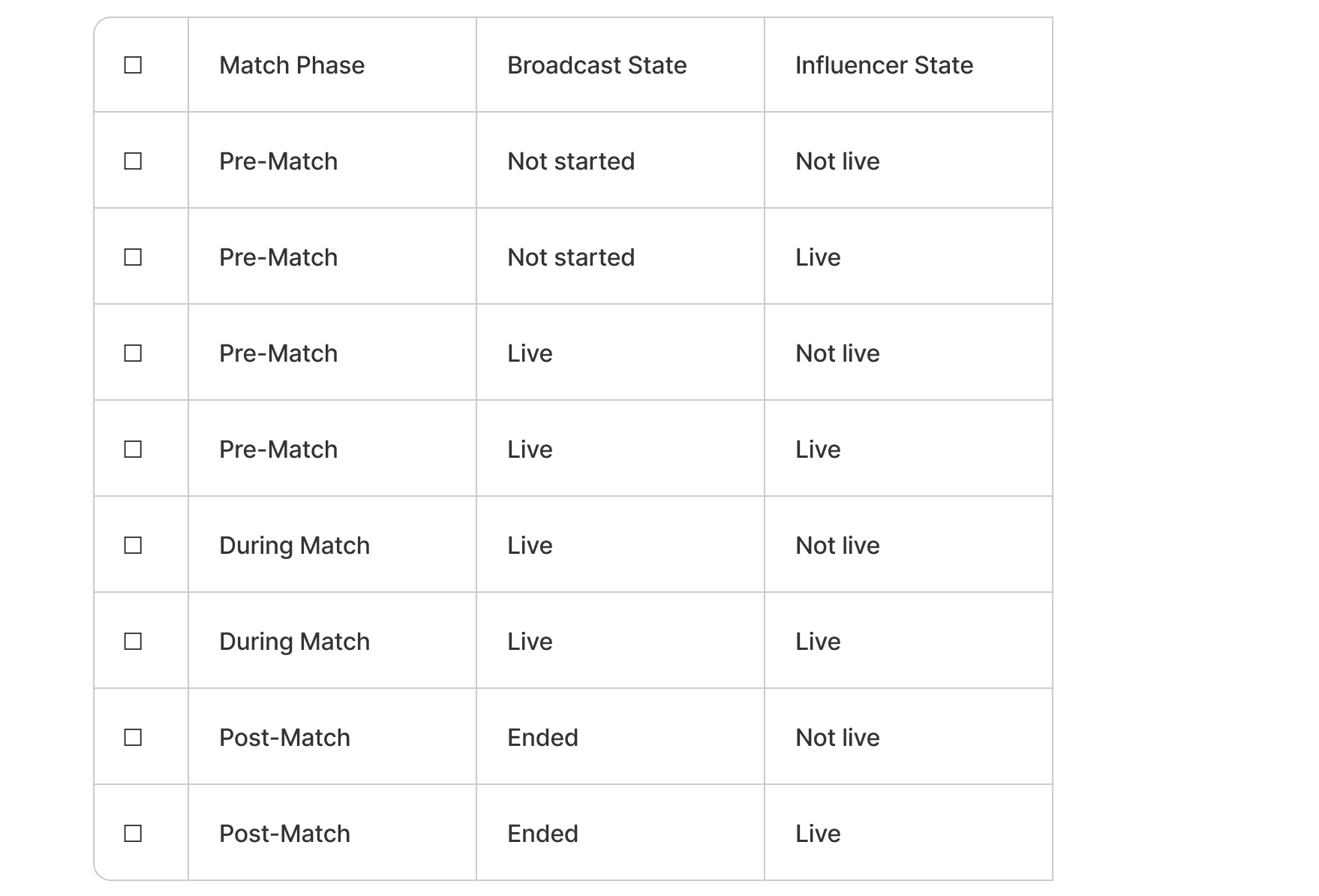
Live sport plus live creators means two independent things can be late. I designed the MDP for every combination: match live & creator live, match live & creator not yet live, creator live & stream not yet live, match complete & creator still live, and match live & creator delayed.
This meant defining creator card states as a system: upcoming (with date/time), starting soon, live now (with concurrent views), delayed, abandoned, and completed. Every state had a defined card, so the MDP never showed a dead end — if a creator abandoned, the user still had the broadcast.

Landscape: Split Screen vs. Overlay
The core rule: never hamper the match.
Landscape is where people actually watch, so the creator layer couldn't degrade the match. I evaluated overlay vs. split screen: overlays cover the action at the moments that matter (and our existing ones were already inconsistent), while split screen gives the match an untouched viewport.
We went with split screen at 70/30
(standard range 60/40–75/25) — the match keeps the majority share, nothing sits on top of the video. Chat got a soft limit of 28–32 characters (one line, based on YouTube live comment behaviour) with a hard cap of 80, and existing player features — audio la
Discovery & Branding
A new feature nobody finds is a feature that doesn't exist.
Watch Along needed presence across the app — but each touchpoint had a real dev cost, and we were designing against time. For every placement I specified two versions: the ideal (dev needed) and a shippable fallback (no dev needed).
Homepage hero: branding badge on the match card (dev needed) vs. a marketing card replacing the match card entirely (no dev — we shipped this first)
Mini match cards & tour cards: Watch Along badge (dev needed)
Dedicated rail: "Watch Along with creators" — branded section with creator cards per match
Nudge: a carousel of creators (dev needed) vs. a single-influencer nudge using the existing component (no dev)
This gave the team a launch plan that didn't wait on engineering: ship the no-dev placements at launch, upgrade to branded components as dev bandwidth opened up.
Conclusion
Watch Along is a case study in adding a feature without adding a journey. The three hard problems — state coverage, viewport protection, and discovery — were all versions of the same principle: the new layer must never cost the existing experience anything.
Mapping the 6 user cases and every live-timing scenario upfront meant no dead ends shipped. The 70/30 split screen kept the match sacred. And designing dev/no-dev pairs for every touchpoint meant discovery launched on day one instead of waiting in a backlog.